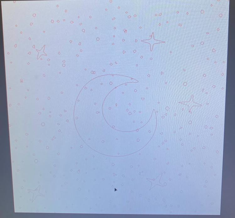
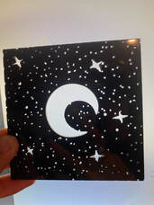
Star Map (failed) |
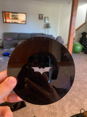
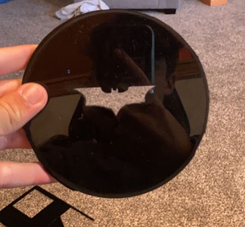
Batman spotlight (succsesful) |
Pre-sketches
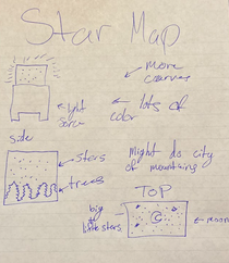
In my original design I wanted lots or detail with trees and the moon but that ended up not working out. I also wanted it to be very colorful.
|
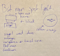
After I changed my final to the Batman spotlight I wanted it to look as close to the movie as possible. So I made everything black and grey/silver in my design. I still needed it to work with the materials that I had though. I got the idea because I watched The Batman the day before.
|
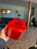
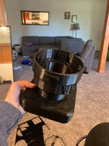
3D Printed base
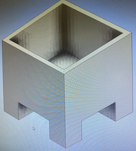
I did this design with the idea in mind that I wanted to have lots of soft curves and not many hard corners. That didn't end up happening with this so I made so improvements on the design and cam out with what you see below. I mostly just rounded out the bottom.
|
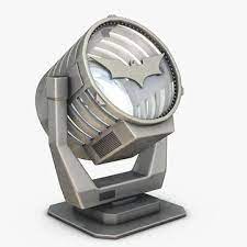
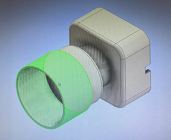
The image on the left is what I was trying to recreate. I had to tweak the design a little because I needed to incorporate my lamp stand and light. I also wanted it to be black to match the batman darkness theme. Overall I feel like I matched the silhouette very well.
|
|
|
|
Laser Cutout
At first I wanted all of these details but then I realized that that wouldn't work because there was to much light being let out and it was very burry on the celling.
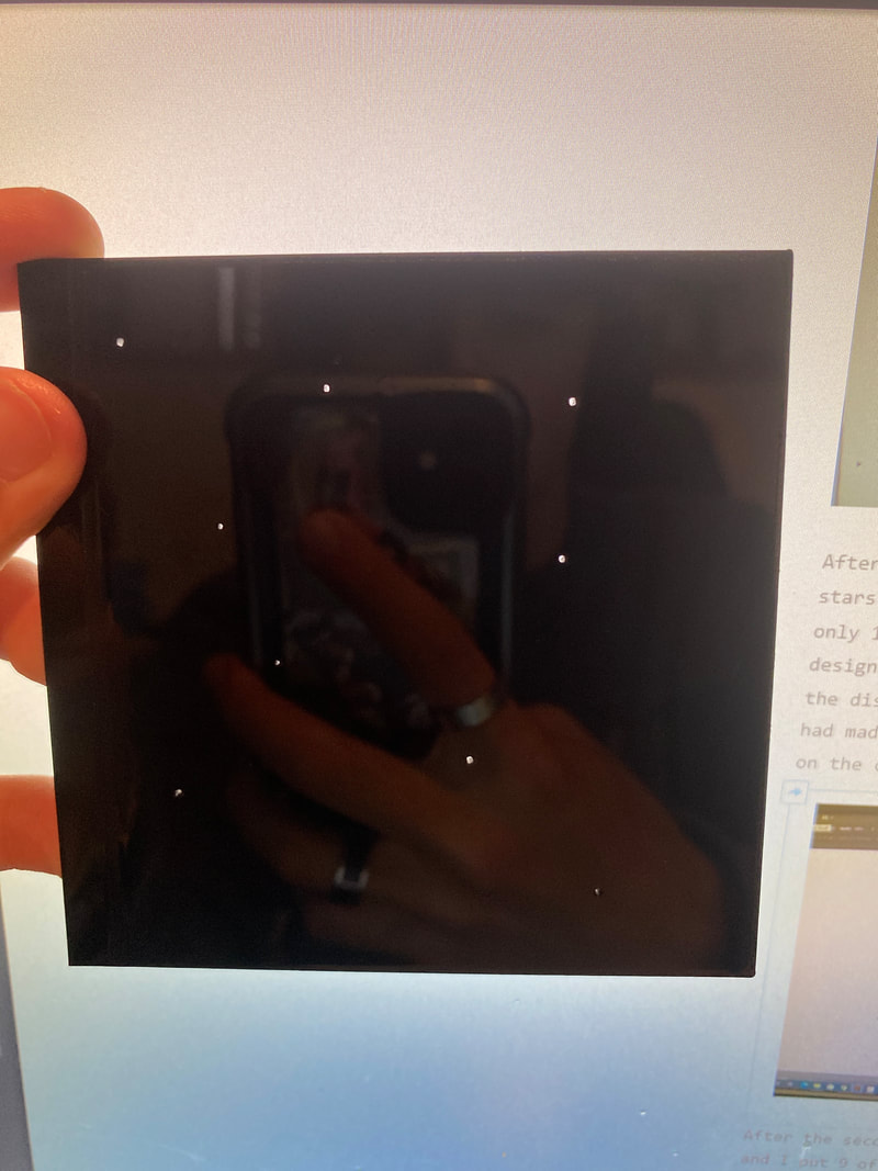
After the first failed attempt, I new that I had to make the stars a lot more simple. Knowing that I made a design that had only 13 stars, instead of the almost 100 stars that the other design had, that I had put in manually so that I could choose the distance between them. The problem with this one is that I had made the holes for the stars to big so it was still blurry on the celling when I tested it.
After the second failed attempt, I made the stars a lot smaller and I put 9 of them instead of 13. I did this in hopes that they would take up less space and not overlap like the last design did. The problem with this design was that I couldn't see the stars all all and there was not enough light going through for the stars to even appear on the celling.
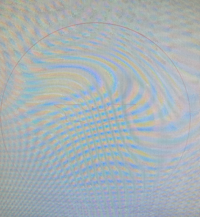
After yet another failed attempt, I made a test design. This design was meant to find out what size I needed to make the stars. the range was .1 of an inch to .01 of an inch. The problem was that at .06 it was to big and at .05 you couldn't see the star. This is the point where I changed my project because I was loosing hope for the star map.
|
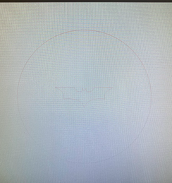
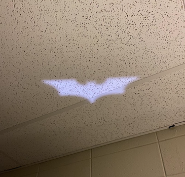
I think that the fist design would have worked just fine but the main problem was that is didn't fit in the base the way that I needed it to and it came out not a perfect circle for a reason that I don't know. I lost the file for this because I had to use a USB that wasn't mine. I did get a cool Batman logo out of this so I'm still happy with it.
The moment that I cut this out I was happy with it. It was a perfect circle. It had clean cuts. On top of all of that the designing of it took 10 minutes. Really the only difference between the two designs was that the circle around them was smaller.
|
You will only see things for the Batman project from this point on.
The Vengeance Vinyl
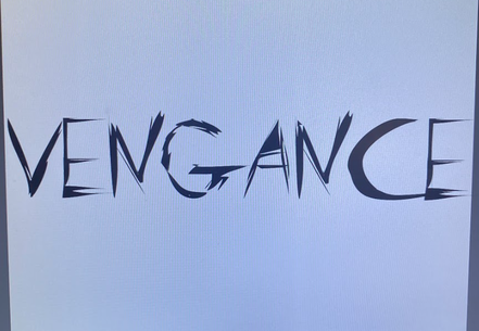
This was the first design that I had in mind. In the back of my head I knew that It would not work so I didn't even cut it out on the vinyl cutter.
|
|
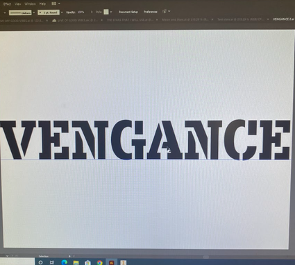
This is the second design that I came up with. I liked the font a lot more and it worked on the vinyl cutter. I picked it out because I thought that it matched the batman theme very well and it would give good contrast to the black. I wanted it to pop out and it did.
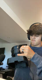
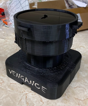
The Final Result
|
|
Over all I am very happy with how this turned out and think that it looks amazing. Everyone that saw it in class thinks so also which made me even more happy with the design.
What I learned
|
Time Management - The main thing that I learned in this class is time management. I feel like if I managed my time better then I would not be as stressed at the end to get everything done. Time management is a great skill to have in life. It will help me in college and in my future as a whole. If one weakness of mine showed the most in this class it would be time management and I now know that I have to work on that.
|
The machines - I got better at using all of the machines throughout this project. The 3D printer I had to use twice because the filament got jammed. So I learned how to unjam filament. The laser I had lots of problems with but I learned how to use the manual controls to get around them. Finally the vinyl, I learned different ways to fix problems when the vinyl cutter starts beeping at me.
|
